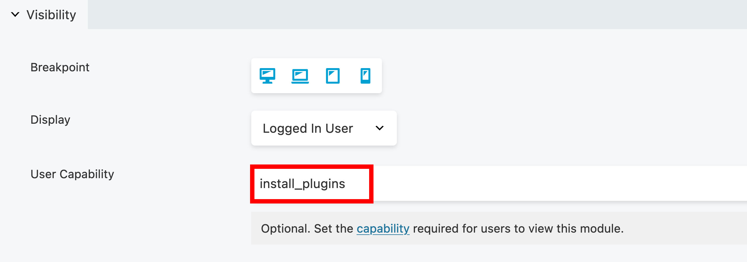
Visibility
The Visibility section in the Advanced tab lets you determine when your rows, columns or modules display in your layout using breakpoints and conditional logic.

The Reverse Stacking Order option is only available for Columns.
Breakpoint
By default, every row, column, and module is visible on every device size. You can use the Breakpoint setting to hide individual rows, columns, and modules for certain device sizes. In the Global Settings, you can view the default breakpoints and set custom values.
Device Toggle Icons
Using the device toggle icons, you can quickly select which devices display or hide a row, column, or module. Simply click the device icon to toggle whether the element is displayed (blue) or hidden (gray) for those devices.
You can choose one of the following device toggle icons:
Extra Large Device
The element will be visible or hidden for desktop computers or TVs with a browser.Large Device
The element will be visible or hidden for small desktop computers, laptops, and landscape tablets.Medium Device
The element will be visible or hidden for devices like small tablets.Small Device
The element will be visible or hidden for devices like portrait tablets, and smartphones.
Multi-selection
All device toggle icons are enabled (blue) by default, indicating that the corresponding row, column, or module is always displayed. The device toggle feature allows for multi-selection, enabling users to choose more than one device at a time. This eliminates the restriction of pre-defined combinations such as Large & Medium or Medium & Small, giving users the freedom to create any combination they desire.
For instance, users can choose to display a row on Extra Large, Large, and Small devices while hiding it on Medium devices. Similarly, a Heading module can be hidden on Extra Large and Small devices but displayed on Large and Medium devices.

Stacking Order (Columns only)
This option only applies to columns, allowing you to reverse the stacking order of columns for medium and small devices. You can choose from the following options:
- Disabled (Default)
- Small
- Medium
- Small & Medium
See the Columns Stacking article for more information.
Display
The Display option lets you display your row, column or module based certain conditions such as never, always, logged out users, logged in users and conditional logic (requires Beaver Themer).
Never
The row, column, or module is only visible to the user editing the page. This is useful if the design isn’t complete and ready for publishing. Using this feature is an excellent way to ensure that your design is exactly how you want it before making it public on your page layout.Always
The row, column, or module is visible at all times for every user.Logged Out Users
The row, column or module will only be visible for logged out users.Logged In Users
The row, column, or module is only visible to users who have logged in to your website. You can also use a WordPress capability to limit the visibility to certain user roles. To achieve this, specify a capability that is unique to the user role and not shared by other.As an example, if you wish to hide a row from all users except those with the Administrator role, you can input the capability
install_pluginsas it is exclusive to users assigned to the Administrator role. caution
You cannot add WordPress user roles to this option; it only accepts WordPress capabilities. Adding a WordPress user role to this option is invalid and won't trigger any action. If you need to hide a row or module for a specific user role without adding WordPress capabilities, it's better to use the Conditional Logic option instead.
Conditional Logic (requires Beaver Themer)
This option enables the showing or hiding of rows, columns, or modules based on specific conditions. For example, if you have posts categorized under a specific category, you can opt to display a different Heading module for them. Another example would be to hide the featured image if no image has been set for the post.For additional details, please refer to the Beaver Themer Conditional Logic article.
Display Icon Indicator
When you restrict the display of a row, column, or module, an eye icon will appear in the Beaver Builder UI overlay. The color of the eye icon will change based on the display option you have chosen. This feature provides a visual indication for you to easily identify the visibility status of your content while you are editing your layout.
The display icon indicator is also visible in the Outline Panel.
When you limit the display of a row, column, or module using the Never, Logged Out Users, or Logged In Users options, a blue Eye icon will be displayed in the Beaver Builder UI overlay.
When you limit the display of a row, column, or module using the Conditional Logic options, a red Eye icon will be displayed in the Beaver Builder UI overlay.
