Menu
The Menu module can give you more options for menu content, style, and layout than the menu available in your theme or widget area. It also gives you the ability to insert a menu anywhere in your layout.
The Menu module displays items from a WordPress menu that you designate. It has several choices of layout. Menu alignment, colors, and typography are set on the Style tab.
Ideas for using a Menu module
- Use special menus in your Beaver Builder page layouts. For example, if you have one group of static pages on your site related to a particular topic, you could create a special menu for the pages in that particular group and display the links in a Menu module on the main page in that group.
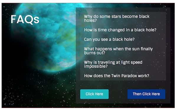
- If you have FAQs that contain fairly long answers, create a separate post for each individual FAQ, then create a menu item for each post, then use that menu in a Menu module embedded in your page content. That menu serves as a table of contents linking to the post that contains the answer. The following screenshot shows an example of a menu used as an FAQ table of contents.
General tab
Menu
In the Menu field, choose the WordPress menu that you have defined in Appearance > Menus from the WordPress admin panel. This menu defines which items are displayed in the menu.
If the website has no menu, this field says No menu found with a link to add one, which opens Appearance > Menus in a new tab. When you're finished, close the additional tab and reload your layout page in the previous tab to display the new menu choice.
Layout
The Layout setting has four layout options, described in detail in the following sections.
On large screens, Horizontal layouts tend to work better in wide short columns, while Vertical, Accordion, and Expanded layouts tend to work better in narrow tall columns.
Why? The horizontal layout's menu boundary is fit to the menu items. In the following screenshot, you can see a horizontal menu with a color background, inside its column.

The following screenshot shows a vertical layout with a color background in the same column. The menu's boundary is sized to fill the column width and the submenu and search icons are right-justified. You can adjust the width of the module by changing the column width or adding margins or padding to the containing row or column, or increase the margin of the Menu module itself.
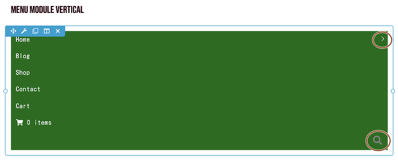
The Accordion and Expanded layouts look the same as the vertical layout. Their differences lie in how their submenus behave.
Layout: Horizontal
This option is a standard horizontal layout that supports dropdown submenus, with a Submenu layout choice of a down arrow, plus sign, or nothing. This screenshot shows a horizontal menu with a down arrow for the item with a submenu.

You can also add an image to a horizontal layout that appears centered between the menu items by using the Centered + inline logo settings.
Layout: Vertical
As described above, the vertical menu fills the width of the column, with the submenu icon and search icon right-justified.
The submenu expands to the right and overlays the next column, as shown here:
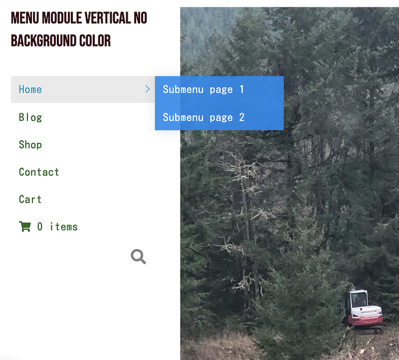
Vary the submenu color opacity at Style > Dropdowns > Dropdown background color to control whether content displayed underneath the submenu bleeds through or not.
If the vertical menu is in the rightmost column, the submenu displays to the right if there is room between the right edge of the menu and the edge of the browser screen, as shown in this screenshot.
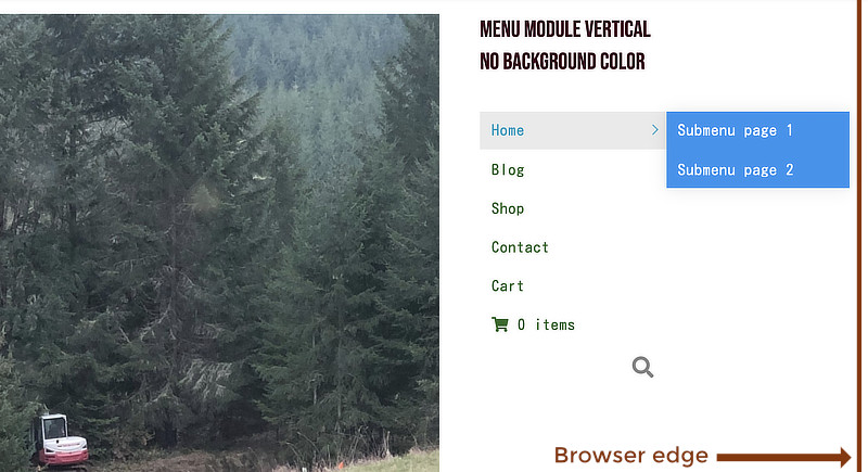
If there's no room to expand to the right, it expands to the left. For narrower menus, this means the submenu can cover items in the main menu while it's displayed:
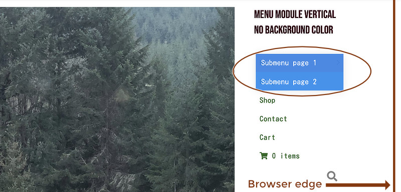
The behavior changes when the menu is displayed as an icon. See the section on responsive behavior.
Layout: Accordion
The Accordion layout is a vertical layout that expands the menu to display submenu items inline when the toggle icon is clicked. Here's a screenshot showing two submenu items after the down arrow on the Home menu link was clicked.
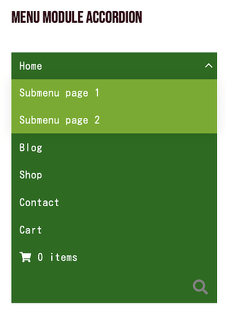
You can see from the screenshot that the submenu is left-aligned with the main menu items, so it's a good idea to change the submenu background color at Style > Dropdown.
Layout: Expanded
The Expanded layout is similar to the WordPress Navigation Menu widget. The following screenshot shows an example. Top-level menu and submenu items are displayed in a list and both top-level and submenu items are left-aligned.
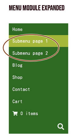
- You can distinguish submenu items from main menu items with different background colors. The hover color shown in the screenshot comes from the Style > Dropdowns > Link hover background color. The Style > Dropdowns > Dropdown background color is ignored. :::
Submenu icon
The Submenu icon option is available for Horizontal, Vertical, and Accordion layouts. The choices are as follows:
- Horizontal and vertical layouts: down Arrows, Plus sign, None
- Accordion layout: Arrows or Plus sign
Menu name
The value you set for Menu name appears in two places:
- The responsive Menu button, if you have chosen that in the Responsive Toggle section.
- The ARIA label in the HTML output, to help accessibility tools identify the menu. For example, if you change the default value Menu to primary menu, the HTML included with the Menu module appears like this:
<nav
  aria-label="primary menu"
  itemscope="itemscope"
  itemtype="https://schema.org/SiteNavigationElement"
  class="focus"
></nav>
Centered + inline logo
When Layout is set to Horizontal, there's a Centered + inline logo section with an option to add a logo that appears in the center of the menu items, as in this example.

This section has two fields:
- Logo image Click Select photo to add the image.
- Inline logo position When there's an odd number of menu items, the logo cannot appear exactly in the center, so you can choose whether it appears to the left or the right of center. In the following screenshot, Inline logo position is set to Right, so there are four menu items on the left and three on the right. The WooCommerce Dynamic Cart, which shows information about the cart contents, counts as one menu item, as does the search icon.

Horizontal menu items wrap onto a second line as screen size decreases, so be sure to test responsive behavior. The alignment of the wrapped line follows the alignment setting in the Style > Menu section. :::
Add search
In the Search section of the General tab, you can show or hide a search icon to the menu, shown in this screenshot.
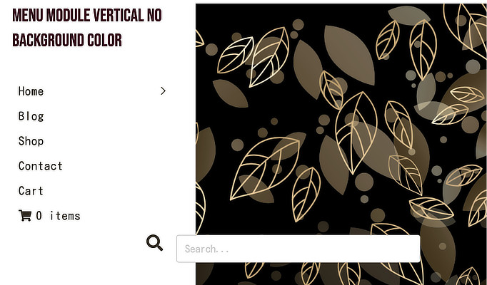
You can replace the default icon with an icon from the available icon sets.
In the Search menu section of the Style tab, you can style both the search icon and the search form that appears when you click the icon.
Set responsive behavior
The Responsive section on the General tab controls how the menu layout changes as screen width becomes smaller, with the following settings.
Responsive toggle
- Hamburger icon
The hamburger icon is three horizontal lines. If you want a background color, as shown in this screenshot, set it at Style > Dropdowns > Dropdown background color.
- Hamburger icon + label
This setting includes both the Hamburger icon and a MENU label, with an optional background (set on the Style tab).
- Menu button
This setting is a button with a label. By default, the menu button label is Menu unless you have a custom setting for Menu name.
- None
With this setting, the menu items continue to be displayed on smaller devices rather than changing to a Hamburger icon or Menu button.
For a menu whose Layout setting is Horizontal, another setting appears immediately underneath the None setting, called Stacked layout. As shown in the following screenshot, if this setting No, the menu remains horizontal and wraps on small devices. If Yes, then on smaller devices the menu items are displayed in an Accordion (vertical) list.
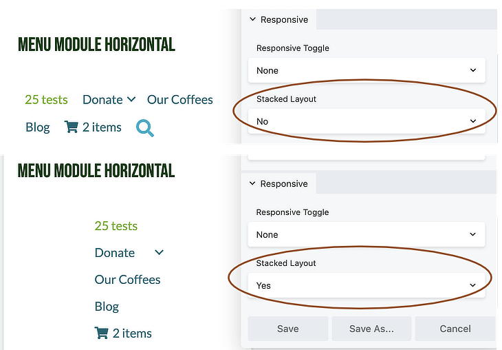 For all other menu layouts, the None setting displays an Accordion layout.
With the None setting, you won't see the settings for Responsive style and Responsive breakpoint described in the following two sections.
Responsive style
This setting has the following options for menu expansion when the responsive icon or button is clicked.
- Inline The expanded menu falls below the hamburger. This works for centered menus but doesn’t work if, for example, you have a hamburger in a small column on the right. The menu gets squished.
- Below row This option removes the menu in the markup and puts it below the column that the menu is in. This means that expanded menus in small columns still appear inline but don’t get squished.
- Overlay See this Beaver Builder Theme article for an example.
- Flyout overlay See this Beaver Builder Theme article for an example.
- Flyout push See this Beaver Builder Theme article for an example.
- Flyout push with opacity See this Beaver Builder Theme article for an example.
Responsive breakpoint
By default, the responsive menu appears on small devices only, but you can change the behavior to medium and small devices, or all devices.
WooCommerce tab
If the WooCommerce plugin is installed, there's a WooCommerce tab with settings for the WooCommerce dynamic cart, which includes quantity or pricing information. The following screenshot shows the difference between the Cart menu item added to the WordPress menu at Appearance > Menus versus the dynamic cart added with the Menu module:
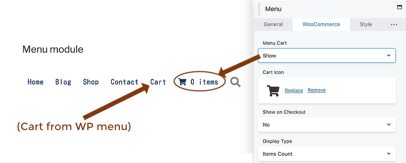
This tab has the following settings.
- Menu cart If you choose Hide, the word Cart appears instead of the dynamic cart.
- Cart icon You can replace the default Cart icon with another icon from your icon library.
- Show on checkout This setting determines whether the dynamic cart icon appears in the menu on the Checkout page.
- Display type This setting lets you choose which dynamic information appears with the icon: number of items in the cart, total purchased, or both.
You can style the options you choose in the WooCommerce dynamic cart section of the Style tab.
Style tab
The Style tab has the following options.
Menu section
This section has two settings:
- Menu alignment Left, center, or right alignment of main menu items.
- Menu background color
Links section
- Link color Set the color of the menu items when they're not active.
- Link hover color Set the color of the menu items that are either active (displaying that page), on hover with a mouse, or immediately after being tapped.
- Link hover background color You can optionally set a background color for the menu items that are either active (displaying that page), on hover with a mouse, or immediately after being tapped.
If you're using the Beaver Builder Theme, the default menu link colors appear in the color you defined in Appearance > Customize > General > Accent Color, and you can customize this color.
- Link padding The number of pixels or ems of padding between menu item text and the menu item boundary.
- Link typography See the article about typography settings Typography section to style your menu text.
If you are using the Beaver Builder Theme, the default font family is what you defined for content in Customize > General > Text.
Separators section
Set Show separators to Yes to display horizontal lines between menu items.
Dropdowns section
These settings control submenu items in the following categories
Dropdown color settings
This screenshot shows an example of the dropdown color settings listed below.
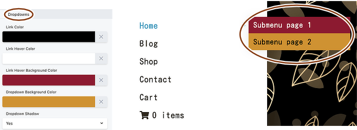
- Link color
- Link hover color
- Link hover background color
- Dropdown background color
- Dropdown shadow Shows a drop shadow on the submenu items.
Dropdown padding
- Dropdown padding
Adds padding between the dropdown boundary box border and the block of menu item text. Here's an example of Dropdown padding set to 20px, Dropdown link padding set to 0px:

- Dropdown link padding
Adds padding around the text for each dropdown menu item. Here's an example of Dropdown padding set to 0px, Dropdown link padding set to 20px. Because the dropdown link padding is set both on top and bottom, the distance between the two submenu items increases to 40px:

Dropdown border
You can add a border, round the corners, and add a shadow around the dropdown submenus. See the article about border settings.
Dropdown typography
See the article about typography settings Typography section to style your submenu text.
Responsive dropdowns
You can style the following responsive dropdown settings differently from the dropdown settings for larger devices:
- Link color
- Link hover color
- Link hover background color
- Dropdown background color
Responsive Toggle section
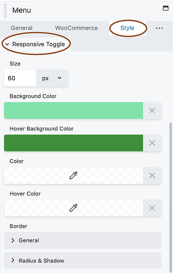
If General > Responsive toggle is set to anything other than None, there's also a Responsive toggle section on the Style tab where you can set the size of the Responsive toggle plus submenu dropdown background colors, text colors, and borders, as shown in this screenshot.
Search Menu section
If General > Search menu is set to Show, there's a Search menu section on the Style tab where you can style not only the search icon but also the search form, which appears when you click the search icon. This section has the following settings.
- Icon size
- Icon color
- Icon hover color
- Form width
- Form background color
- Form background hover color
- Form border See the article about border settings.
- Form border hover
- Form padding
WooCommerce Menu Cart style settings
If you have WooCommerce installed and the Menu Cart option set to Show on the WooCommerce tab, then the Style tab has a WooCommerce menu cart section with the following settings.
- Background color
- Hover background color
- Color This setting changes the color of both the icon and any other options you have set to display.
- Hover color
- Typography See the article about typography settings Typography section.
Advanced tab
There are all the usual Advanced tab settings for margins, visibility, animations, and advanced HTML settings.