Column layouts overview
In Beaver Builder, you cannot place rows within rows but you can construct complex column layouts within a single row, such as in the example in Figure 1.
Figure 1: An example of a complex column layout in one row

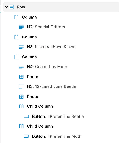
The Outline view for this layout, shown in Figure 2, shows one row with three main columns and two child columns.
Figure 2: Outline panel view of the complex column layout in Figure 1

Here's a schematic view of how the columns in this example are grouped.
Figure 3: Schematic grouping of the column layout in Figure 1
Column groupings are not shown in the Outline panel but do appear in the hierarchical structure in the HTML output. Abstracting away from the actual code, the structure for the columns and modules in the example is as follows:
row
    column group
        column
            Heading module
    column group
        column 2a
            Heading module
        column 2b
            Heading module
            Photo module
            Heading module
            Photo module
            child column group
                column
                    Button
                column
                    Button
In the following sections, we describe some rules and limits for columns. Then we show how column layout affects column stacking at smaller screen widths and the ability to assign column backgrounds and borders.
Basic column rules and limits
- The main columns are divided into column groups, which can be thought of as "layers," stacked vertically in the row.
In the example, there are two main column groups: the top group has one column and the bottom group has two columns. - A row can have from one to an unlimited number of column groups (vertical layers).
- Modules placed side by side must be put into separate columns.
A main column group can have a maximum of 12 columns. - Any column within a column is a child column and is also treated as a column group.
A child column group can have a maximum of four columns. - Any column can contain from zero to an unlimited number of modules placed vertically in the column.
Heuristics for column layouts
You can often achieve layouts that look identical on a large screen but have different underlying column structure. There are two main reasons for preferring one layout over another:
- Responsive stacking
Columns stack differently as screen width decreases. The stacking order depends on the column structure. - Background scope
You can apply color or photo backgrounds to individual columns, and this can affect how you want to group them.
Responsive stacking
Here's an example of layouts that look identical but produce different responsive results. Figure 4 shows a layout with four column groups in one row. The third and fourth column groups each have two columns. In this annotated screenshot, each column group is numbered and each column is marked with a blue dashed line.
Figure 4: One row with four column groups

When you look at this layout on a small device, shown in Figure 5, you can see that the stacked order shows the two image headings from the third column group, then the two images from the fourth column group.
Figure 5: Four column groups with undesirable responsive behavior

You can correct this problem by moving the two images into the third column group as child columns, shown in Figure 6.
Figure 6: Two modules in the third column group to improve responsive behavior

Now the columns are stacked correctly in mobile view:
Figure 7: Two modules in the third column group, mobile view

For details about how columns stack, or how to prevent stacking or reverse the stacking order, see the article about responsive columns.
Background scope
Each main column and child column can have its own styling (backgrounds borders, margins and padding), but what if you want the style to apply to more than one column? There are two main solutions:
- Create one or more child columns and apply the style to the parent column.
- Create the same style for two main columns and set the margins and padding to
0on their their shared border so the styling looks seamless.