Search module
The Search module lets you place a standard WordPress search form in your layout. It has a standard input form and a button to activate the search query.
The search functionality and search results are the same as a standard WordPress search widget.
Layout choices and behavior
Layout
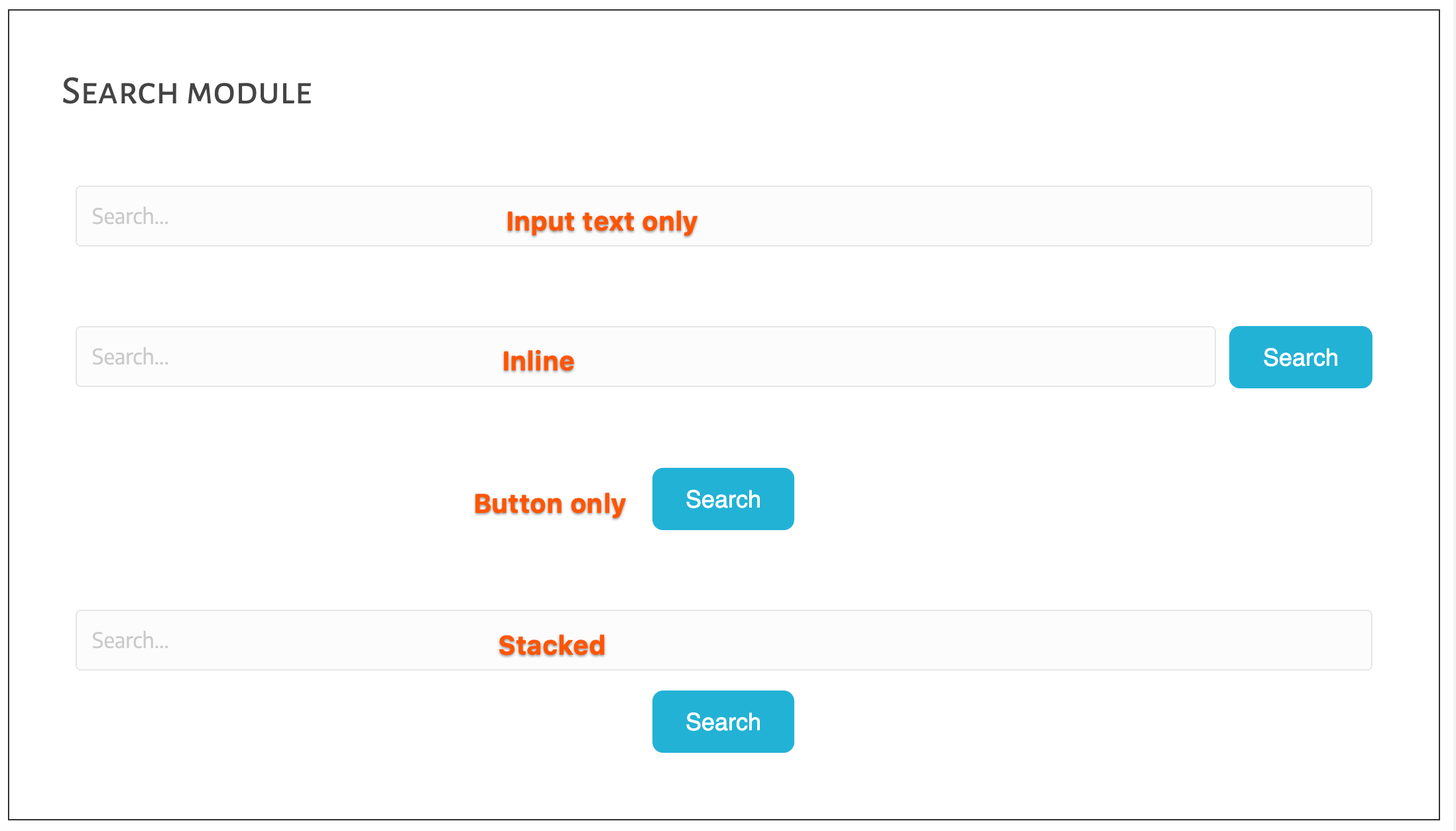
On the Layout tab you can choose from the layouts shown in this screenshot and described below:

Input text only
Only the search input field appears, not the button. Search is activated by using the Return key on the keyboard. With this option, you can customize the text on the Search button.
Inline
The Search button appears to the right of the search field at all device sizes. You can customize the input field placeholder text or the button text. You can add a button icon to the left or right of the button text.
Button only
Only the Search button appears, and clicking the button expands to display the input field according to the option set in the Action field. When the action is Expand on click, the search input field appears to the left of the button. The user enters the search terms and presses Return on the keyboard.
Clicking the Search button when the input field is expanded serves to collapse the input field to show only the button again. In this configuration, you might consider changing the placeholder text to indicate that the user should enter text and hit Return.
When the action is Full screen, clicking the Search button opens a fullscreen window with the search input field displayed there. The user enters the search terms and presses Return on the keyboard, which opens the standard WordPress Search Results archive page.
In either configuration, you can also change the placeholder text, the button text, and add an icon to the left or right of the button text.
Stacked
The Search button is centered under the search field at all device sizes. The user enters the search terms and clicks the Search button or presses Return on the keyboard.
Text and icons on the Layout tab
You can customize the placeholder text message. For the button, you can change the button text and add an icon to the left or right. Other settings for the placeholder and button text and icons, such as color, are on the Style tab. See the next section.
Style choices
If you're using the Beaver Builder Theme, the buttons' initial style comes from the settings at Customize > General > Buttons. The button's default text color
is white text for darker accent colors and black text for lighter colors. The
default font family for the button text depends on the font family set for the
<body> tag.
The Style tab has settings for nearly every aspect of the search form. The settings are divided into the following categories: the main settings, an Input text section, a Button section, and a Button icon colors section.
Main settings on the Style tab
In this section, you can customize settings that apply to the module: width, minimum height, horizontal alignment, background color, border, and padding. Some of the same settings are available specifically for the input field and button in other sections of the Style tab, as described later in this article.
Width
The Width field applies to the width of the module, regardless of layout type. Choices are:
- Auto
No width is set for the module. - Full width
The module width is set to 100%. Custom
A Custom width field appears so you can set a custom maximum width.
For Button only layouts with a Fullscreen input field, the Width setting applies to the module that displays the button, not to the input field in the fullscreen view. The Width setting doesn't change the button width but rather the module width, so the width setting is most apparent when you set a background color or border.
The Button width itself can be set in the Button section. For the Fullscreen option, a Fullscreen section appears at the bottom of the Style tab where you can adjust the width of the input field in the window that opens to display it.
Height
Optionally set a minimum height for the form. Note that this setting does not change the height of the form or the Search button but rather the height of the module, with the search form vertically centered. You can change the input form and button height in other sections.
Alignment
If the Width setting is Auto or Custom, you can select a Left, Right, or Center horizontal alignment. No alignment setting (none of the alignment icons selected) means the alignment will follow the browser default.
Background color
Sets a background color for the module. The size of the background is affected by the Width, Height, and Padding settings.
Hover background color
Upon mouse hover over the module, the background color is replaced with the hover background color.
Border
The Border section has the standard Beaver Builder border settings. The border appears outside the background color if one is set. If no background color is set, the placement of the border is affected by the Width, Height, and Padding settings.
Border hover
These settings apply on mouse hover over the module.
Padding
Increases the space between the module border and the search controls (input field, button). Note that there are Padding settings in other sections of the Style tab that apply to the padding inside the input field or button.
Input text section on the Style tab
These settings affect the input field's text and styles.
- Color section
Changes the color of the text in the input field, both the placeholder text and the text that the user enters. - Typography
Standard Beaver Builder typography options for the input field text, both placeholder and search input. - Border
The input field border by default is light gray but you can use this Border section to change the border type, color, width, and radius, and you can add a border shadow. - Border hover
Set border options that replace the input field's border settings on mouse hover. - Padding
Set padding options for the space between the input field's border and its text.
Button section on the Style tab
This section's settings affect the text and styles for the button. This section does not appear when the layout is set to Input text only.
- Alignment
Select a Left, Right, or Center horizontal alignment. No alignment setting (none of the alignment icons selected) means the alignment will follow the browser default. - Width
Choose between Auto and Custom width to control the width of the button. If Custom is chosen, a new field open for you to input the custom max width of the button. - Padding
Set the padding for the button to change the distance between the button edges and the button text. - Text color
Set the text color for the button. - Text hover color
Set the color of the text on mouse hover. - Typography
Set the typography options for the button text. - Button background color
Set the background color for the button - Button background hover color
Set the background color for the button on mouse hover. - Button background style
Choose between:- Flat
- Gradient – the gradient is automatically generated.
- Border
Set the border options for the button. - Border hover
Set the border options for the button on mouse hover.
Button icon colors section on the Style tab
If you chose an icon on the Layout tab, you can set the Icon color and Icon hover color in this section.
Set where to display search results
On the Content tab, you can choose where to display the search results. There are two choices:
- Redirect to Search page
This option opens the standard WordPress search results page, which is a type of WordPress archive. If you have the Beaver Themer add-on, you can style this page with an Archive-type Themer layout. - Display results below via Ajax
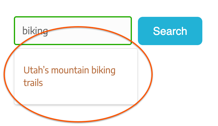
This choice displays the results immediately below the input field in a bordered box such as this: By default, the bordered search box is Full width, which means the same width as the search input field. You can set a custom width in the Width setting to change the size of the search results box. You can also choose whether to display the featured image, a fallback image, and an excerpt of the content. An example of these options is shown in this screenshot, in which Width is set to 800px and both Featured image and Content are set to Show.
You can also customize the text when no results are found.
Advanced tab
There are all the usual Advanced tab settings for margins, visibility, animations, and advanced HTML settings.