Login Form module
The Login Form module lets you add a login to Beaver Builder layouts. A typical use of this module is to provide a login for registered members to access restricted areas of the site.
If you have two-factor authentication enabled for some user roles, for example by using a security plugin, this module may not work for those user roles because the plugin hooks into/replaces the standard WordPress login form. If you find the login is hanging at "Please wait," check your security settings. You could consider disabling two-factor authentication for the roles you want to be able to log in.
The default settings of the Login module are shown in this screenshot:
If you're using the Beaver Builder Theme, the buttons' initial style comes from the settings at Customize > General > Buttons. The button's default text color
is white text for darker accent colors and black text for lighter colors. The
default font family for the button text depends on the font family set for the
<body> tag.
Here are the configuration options.
General tab options
By default, the layout is Stacked, as shown in the screenshot above. You can show or hide the Remember me option and the forgotten password option.
You can also choose Inline, with the following result:
Note that the inline layout doesn't allow the Remember me option or the forgotten password option. However, the user gets feedback while checking in. If the user name fails, the user sees a message that the user name is unknown:
If the password is incorrect, the user gets that message and a link to correct a forgotten password.
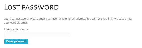
If the user chooses the forgotten password option or link, the user is taken to the standard WordPress my-account/lost-password/ page with the WordPress password reset form.

With both the stacked and inline layout options, you can change the placeholder text for the user name and password fields.
Login Button tab options
This tab has three sections, listed here and described below:
- The main section
- Button icon section
- Button background section
Main section
For Redirect URL, provide URL for where to go when the user clicks the Login button.
You can also change the login button label.
You can set other button style options on the Shared styles tab.
Button icon section
Optionally select an icon to appear on the login button. After you select the icon, you can also set options whether the icon appears to the left or right of the login text and whether the icon is always visible or fades in on mouse hover.
Button background section
You can change the button background color and background hover colors.
Logout Button tab options
If the Show logout button option is set to Yes, then after the user successfully logs in, the login form is replaced by a Logout button.
After the user logs out, the login form returns. One use case would be in a restricted member area, where there's a login form on the main login page and every page in your restricted area. This gives the users a prominent logout button on any page they visit. You can set a redirect URL for the Logout button, for example, to send them back to the main member login page.
You can also customize the button text, add an icon before or after the text, and set button background color and hover color.
Shared styles tab options
You can set options that are applied to both the Login and Logout buttons, namely:
- Button padding
- Input field padding
- Button text color
- Button text hover color
- Button typography (all the settings in the standard Typography section)
- Input field typography
Advanced tab
There are all the usual Advanced tab settings for margins, visibility, animations, and advanced HTML settings.